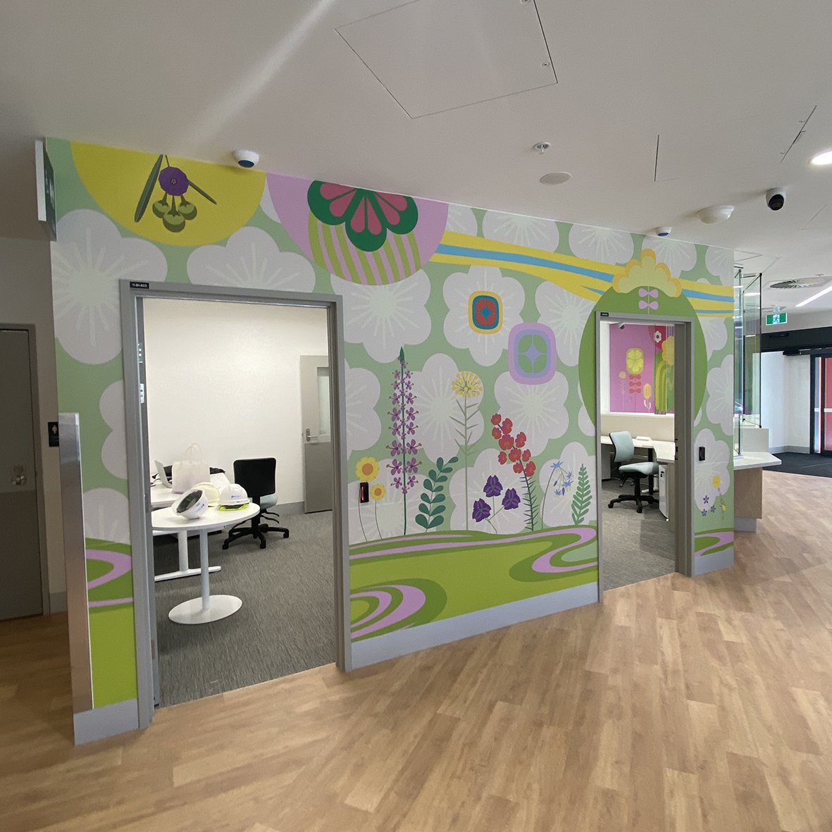
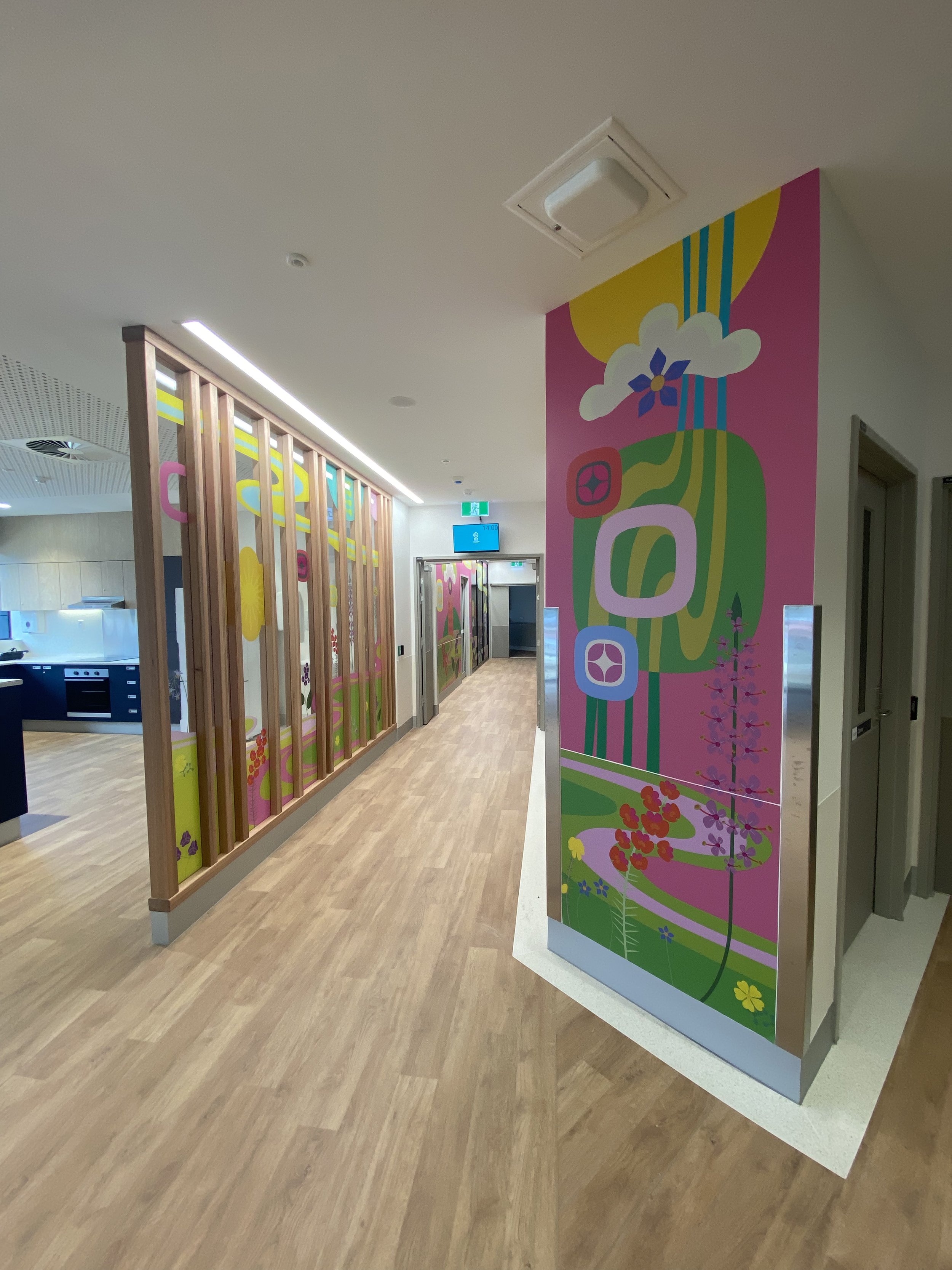
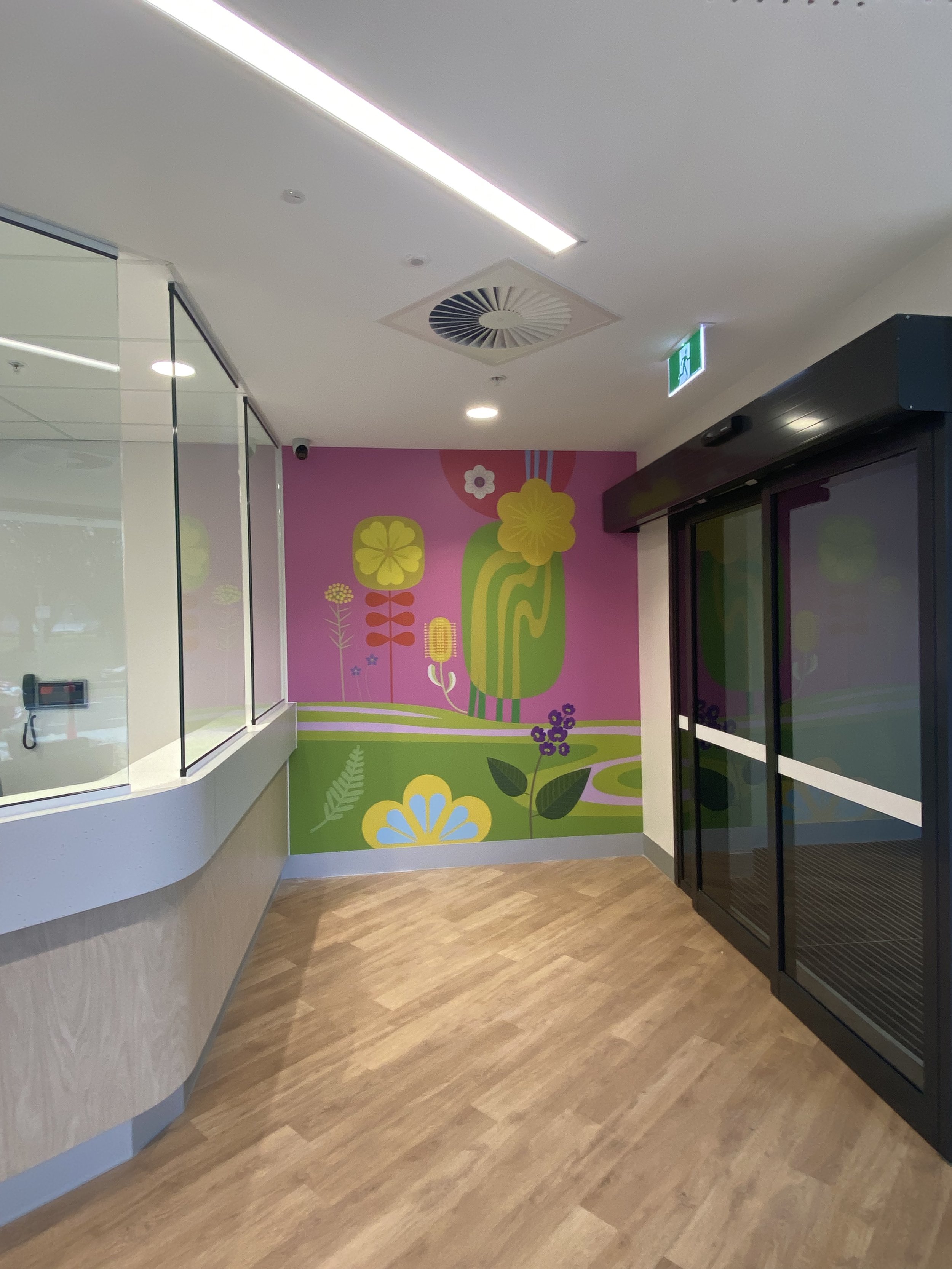
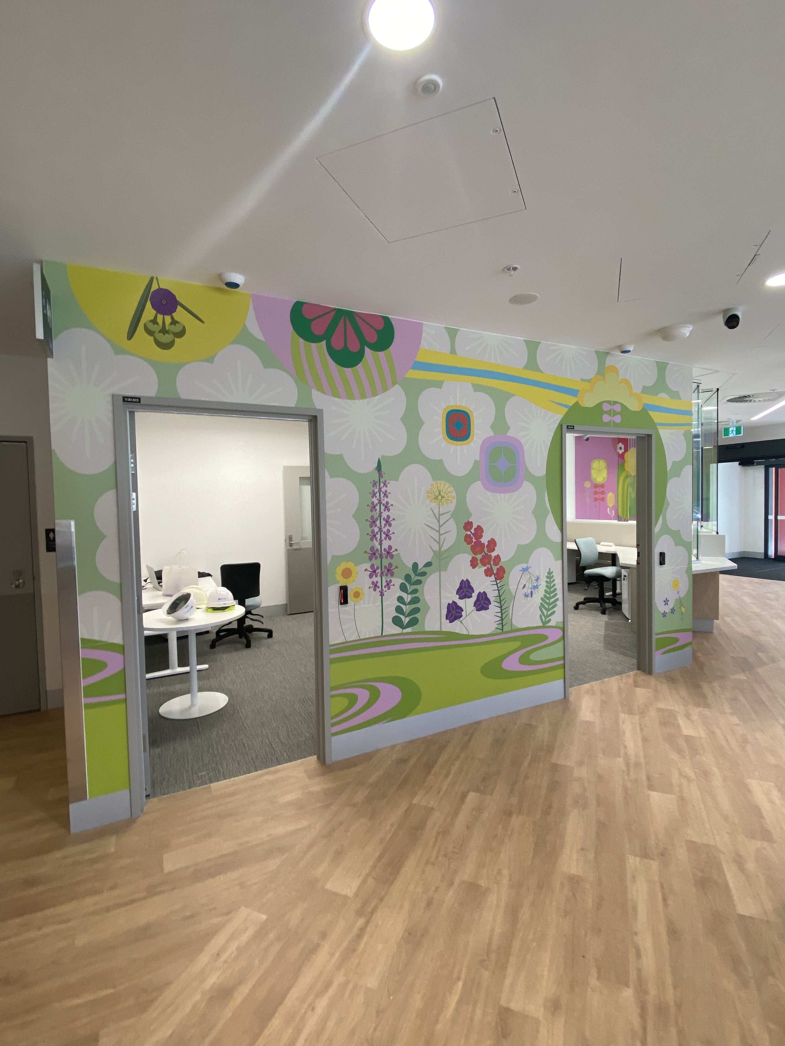
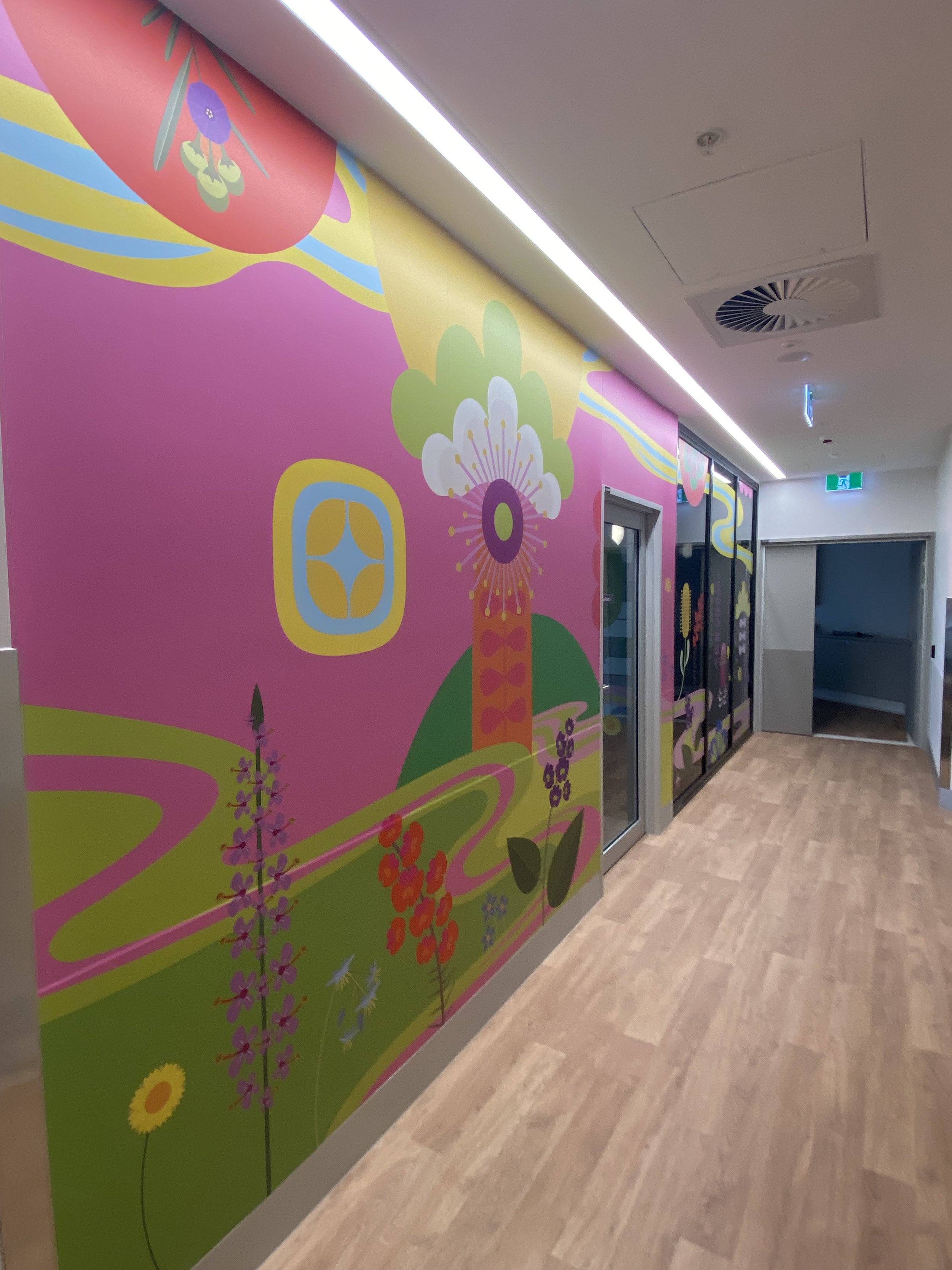
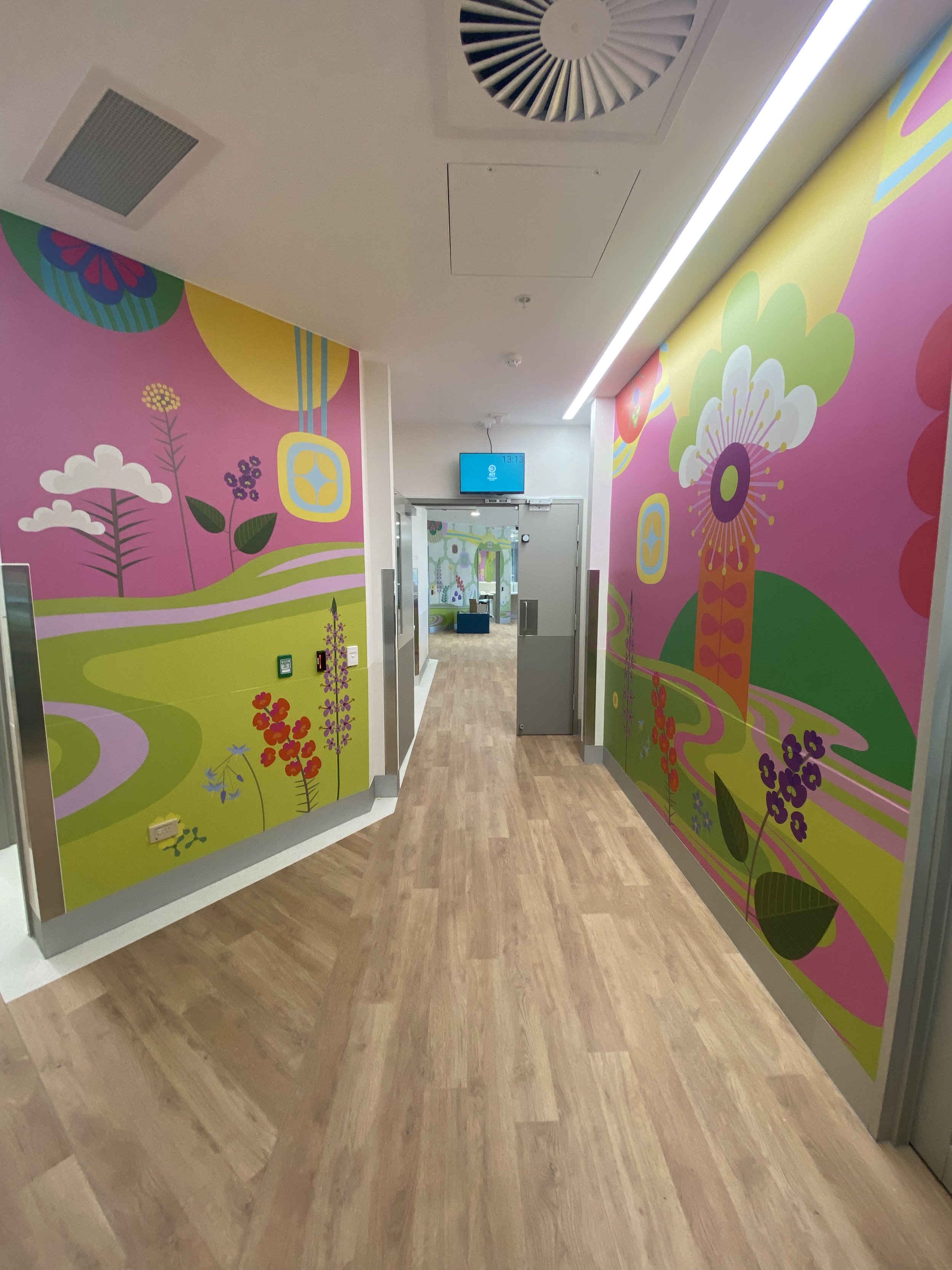
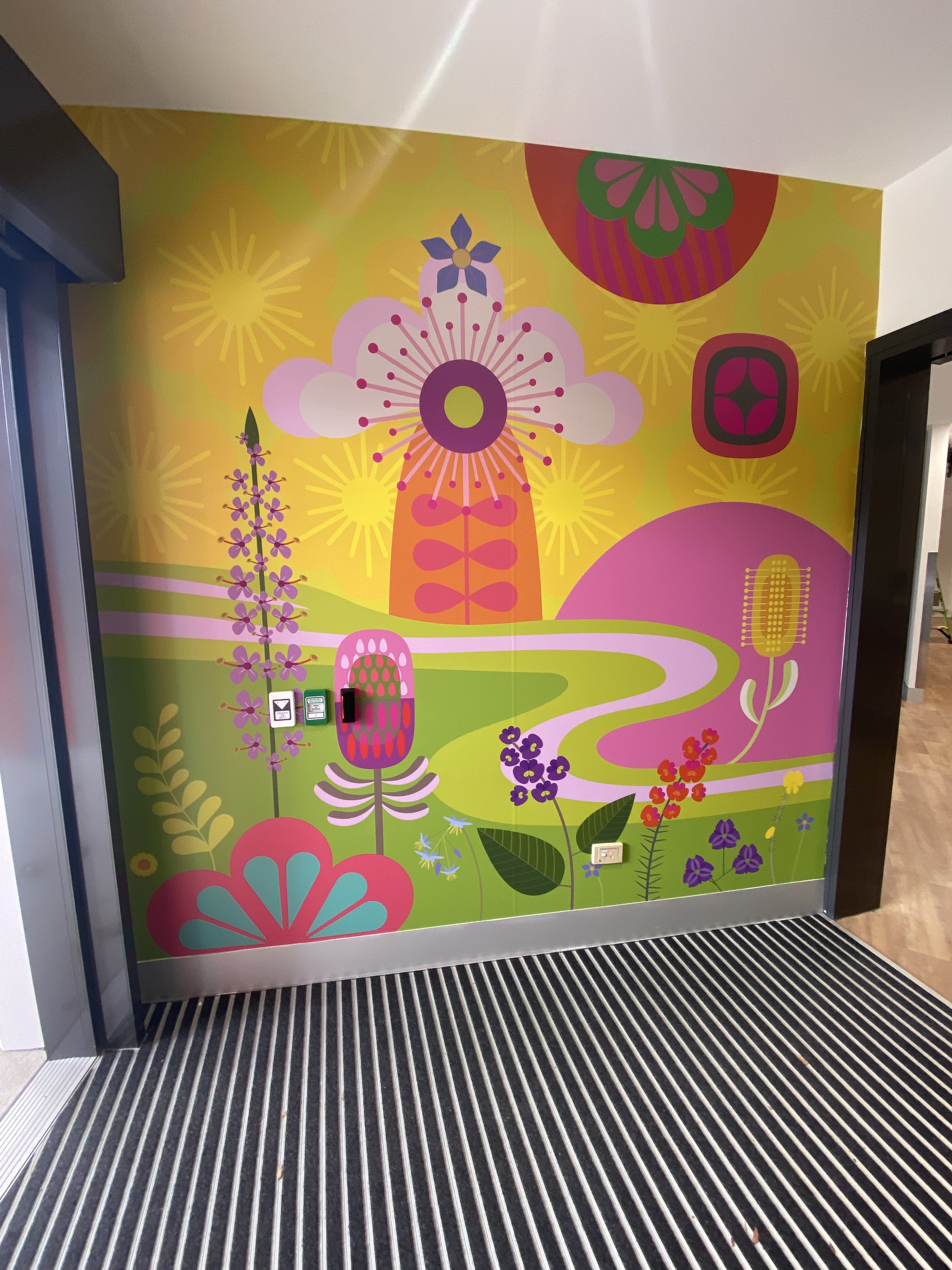
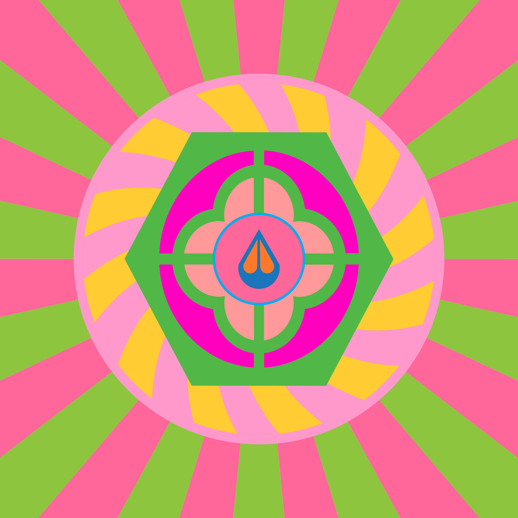
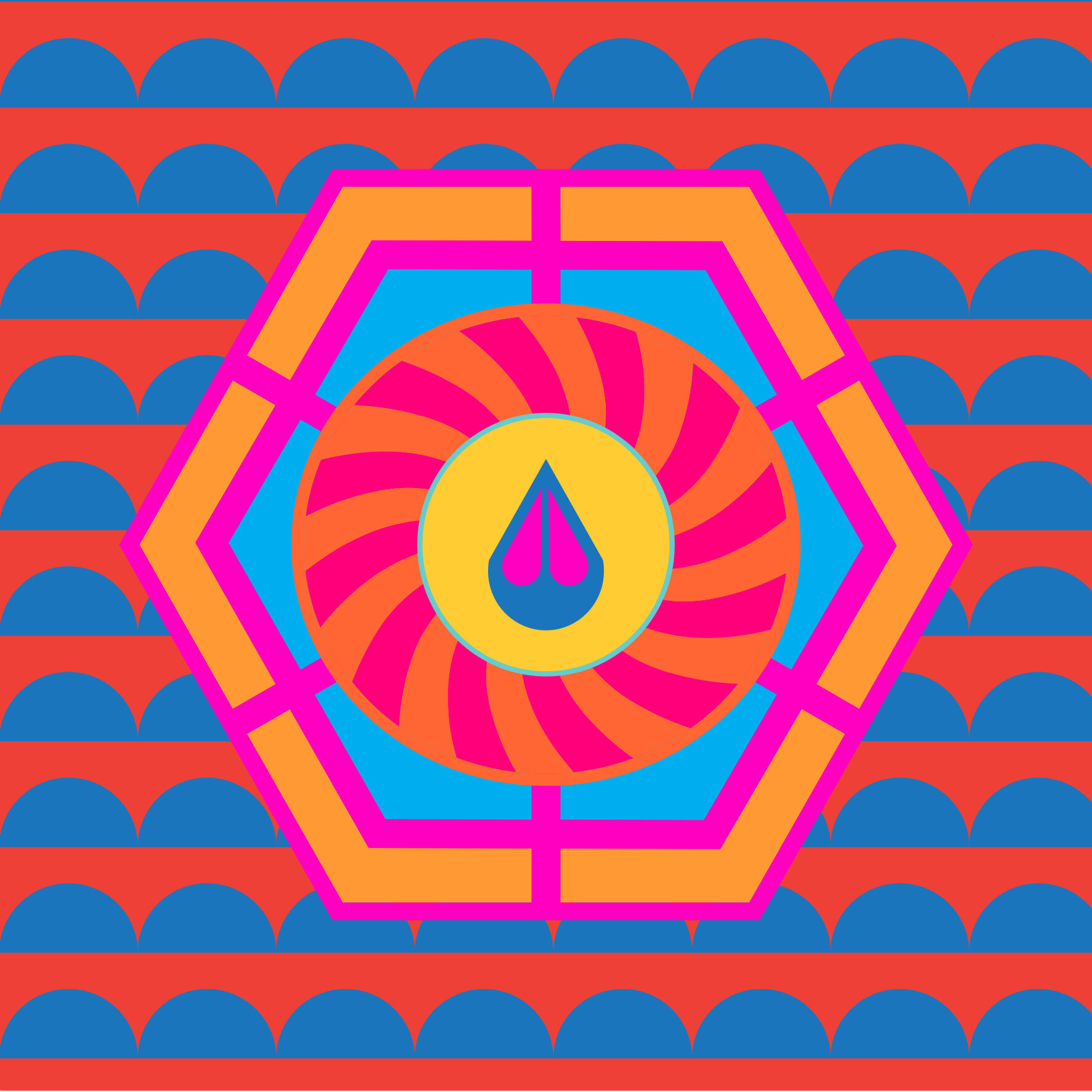
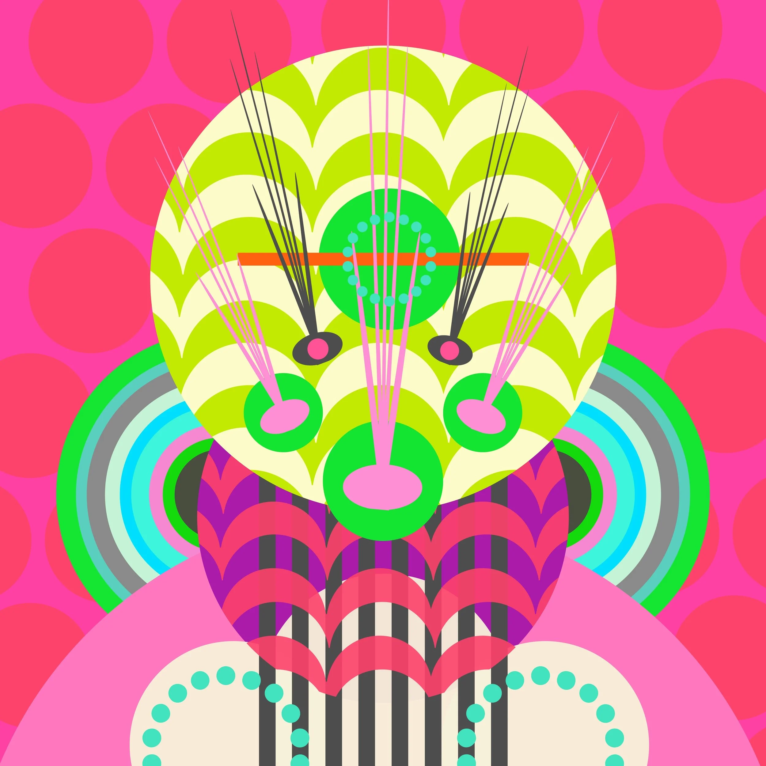
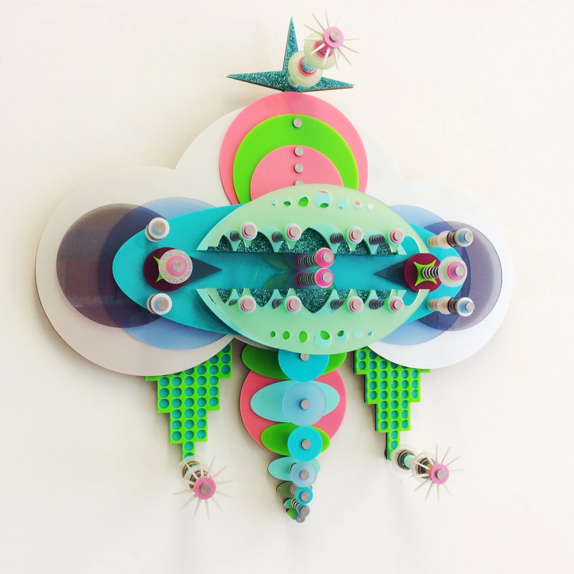
Check out the first of my Canberra Journeys temporary art installations in Dickson- Gateway Arch on Woolley St. Made in collaboration with landscape architect Anna Chauvel at Place Laboratory for the Woolley St Project.
Statement by PLACE Laboratory and Jodie Cunningham Art
Woolley Street in Dickson is well known locally for being family friendly, multi-cultural and having a mix of great inexpensive food. However, after years of neglect and changing public expectations of how an eat street could be experienced, Woolley Street has been identified as needing a major streetscape upgrade. Grounded in place-based principles, the City Renewal Authority has chosen to trial potential changes to transform the street and measure public opinion as part of the Woolley St. Project. The Woolley Street Project will test a series of public realm interventions to give people a firsthand experience of what an improved Woolley Street could look and feel. For 8 weeks, starting at the end of September, Woolley Street will be the focus of activations including changes to the streetscape, installation of additional street furniture, and testing alternative traffic conditions and parking. The activations will also include a series of events designed to attract more visitors to the area, encouraging them to explore and engage with local businesses.
The goal of the interventions is to:
· Create a street for people
· Re-engage the local community and traders with Woolley St.
· Define a shared civic space for activity
· Create economic opportunity for local traders
· Improve access
The key interventions include:
The Gateway | The gateway welcomes visitors to Woolley Street and builds upon the local eat street character. The artwork, designed by Jodie Cunningham Art, contains Dickson and Canberra specific symbols inspired by variety of local sources. The gateway establishes an instantly recognizable identity for Dickson and celebrates Woolley Street’s diversity of cultures.
Eat Street Pavilions | The eastern footpath of Woolley Street is being widened to accommodate an outdoor eating area. Pavilions will provide shade and shelter and a place for friends and families to gather, eat takeaway or just stop and stay in the street for longer. The location of the pavilions defines a possible heart of Woolley Street as a place for future events and activities.
Lighting | Lighting is a key component of creating a welcoming atmosphere at nighttime. The existing lights will be repainted and dressed up with coloured panels, designed by Jodie Cunningham Art, Solar festoon lighting will be hung in the canopies to add another layer of ambient lighting.
Furniture | People will have a greater choice of place to sit and enjoy the street. Different types of seating and materials will be tested for practicality and durability.
More bike racks | Extra bike racks will be installed to encourage people to ride to Woolley Street.
Woolley Street Vibe | Colour, fun and family friendly are reoccurring themes linked to Woolley Street’s vibe. Colourful street murals on the footpaths by Jodie Cunningham Art, coloured umbrellas and furniture and fun seating and play elements, inspired by the noodle bowl – a popular dish associated with Woolley Street will bring more colour and fun to the street.
More Green |The street will be greened with plants, and a temporary lawn area will provide a sunny place for people to sit in the sun.
Pavement to Plaza | Temporary changes to the street are experimenting with Woolley Street becoming more pedestrian focused. Different experiments will help people imagine what Woolley Street could be if it was a plaza. Street mural will be applied to the plaza to demarcate the pedestrian areas. As part of the pavement to plaza experiment alternative parking and traffic arrangements will be tested. A big bonus will be 15 minute parking bays for people picking up takeaway.
Feedback on the Woolley St. Project experiences and evaluation of the success of the experiments will be collected throughout the Woolley St. Project. The information gathered will inform the brief for the design of future upgrades.
Decoding the Symbols - Canberra Journeys
Jodie Cunningham Art, in collaboration with PLACE Laboratory, created the artwork used in the gateway, street murals and light poles, specifically for the Woolley St. Project. She has named the body of work, Canberra Journeys. Concept images can be seen on the Project Page Canberra Journeys.
The Canberra Journeys artworks celebrate cultural diversity in Canberra and reflects people’s connection with Woolley Street through the idea of a journey - large and small journeys, life journeys, ritual journeys like dinners celebrating connection with family and friends, and key life milestone journeys such as first date, first break up, pregnancy, graduations and birthdays.
Canberra Journeys brings a local Canberra feel to the multi-cultural Woolley Street. It is colourful, energetic, immersive and sensory.
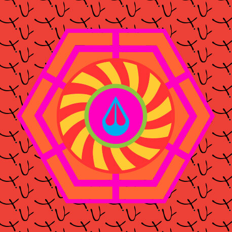
The art work is a composition of contemporary symbols, created to celebrate the idea of ‘Diverse Dickson’- the central premise of the City Renewal Authority ’s Dickson Place Plan. Inspiration for the symbols has come from a variety of local sources including the Marion Mahoney and Walter Burley Griffin 1911 Plans for Canberra, patterns from local suburban architecture - like the 1960s breeze blocks seen in many older Dickson homes, and a popular Woolley St. specialty – noodles. Local Canberra wildflowers, that grow on the nearby Mt Majura and Mt Ainslie, have been included in some of the symbols reinforcing Canberra’s identity as the ‘Bush Capital’. The local symbols have been infused with universal symbols with multiple cultural provenance to enhance the theme of diversity and reinforce connections with ‘Chinatowns’ around the world. This includes the pinwheel, a symbol of celebration and movement, and a reference to both play and ‘turning luck around’, conveying good luck to the people of Canberra.
The different symbols are organised into compositions using the hexagon shape - a direct reference to the geometry of the Burley Griffin plan. The pattern of interconnected hexagons imitates the structure of a beehive - a metaphor of the interconnected Canberra community.
A colourful and warm palette of red, orange and pink with touches of green, blue and purple unifies the collection of symbols and emanates a happy atmosphere of festivity and celebration.
CANBERRA JOURNEYS REFLECTS A CHAOTIC COLOURFUL SENSORY EXPERIENCE OF MULTIPLE CULTURES, FOODS AND DELICIOUS AROMAS COMBINED WITH PERSONAL AND COLLECTIVE MEMORIES.

